import numpy as np
import matplotlib.pyplot as pltPlotting Graphs
The matplotlib is one of the most popular libraries for plotting graphs with Python. Unlike many modern counterparts, matplotlib is primarily designed to produce static plots. It is still a popular option to generate publication quality plots in the academia.
While it is easy to get started, it is very flexible and allows drawing complex things.
While interactivity is not part of its design, we can achieve that using interactive widgets and creating animations. However, that may required a lot more code and may sound tedius.
Needless to day, we use numpy arrays for plotting graphs.
Getting started with plotting
Let’s plot sqrt.
x = np.linspace(0, 2, 100)
y = np.sqrt(x)
plt.plot(x, y)
# add a grid to the graph
plt.grid()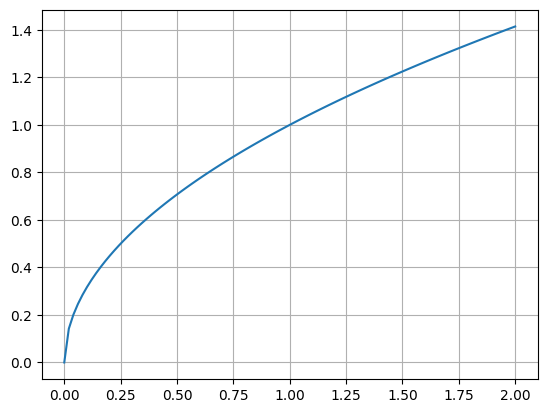
We can even plot multiple plots in the same figure.
x = np.linspace(0, 2, 100)

plt.plot(x, x)
plt.plot(x, x*x)
plt.plot(x, np.sqrt(x))

plt.grid()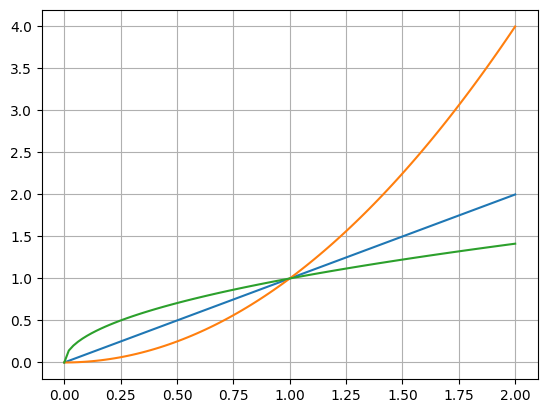
It is handy to add a legend when there are multiple plots in the same figure. And we can use latex for math expressions.
x = np.linspace(0, 2, 100)

plt.plot(x, x, label="$y = x$")
plt.plot(x, np.sqrt(x), label=r"$y = \sqrt{x}$")
plt.plot(x, x*x, label="$y = x^2$")

plt.grid()
plt.legend()

# we can even give a title
# the semicolon at the end of last line is used to supress the output of that expression
plt.title("plot of $x$, $\sqrt{x}$ and $x^2$");
Note that we write the last label as r"$y = \sqrt{x}$". Notice the prefix r before the string. That indicates that it is a raw string. In regular strings, the \ character has special meaning. For example \n means a new line and \t means a tab character.
If we write "$\theta$", python intereprets the \t in it as a tab and matplotlib only sees "$<tab>heta$". To avoid that we use raw strings whenever we are writing math expressions that require using \ character.
Customizing ticks
x = np.linspace(0, 360, 100)
y = np.sin(np.radians(x))

plt.plot(x, y)
plt.grid()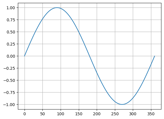
We can customize the ticks.
x = np.linspace(0, 360, 100)
y = np.sin(np.radians(x))

plt.plot(x, y)
plt.grid()

plt.xticks([0, 90, 180, 270, 360]);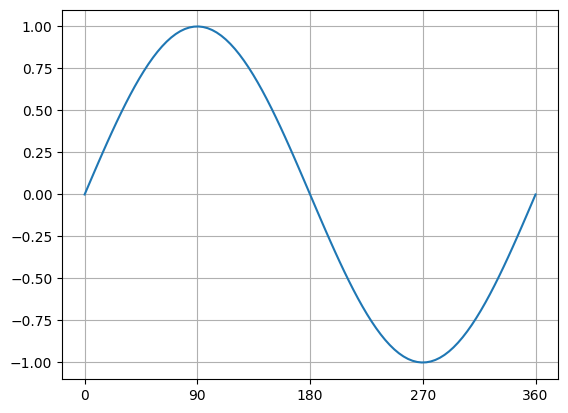
We can even give custom labels to the ticks.
x = np.linspace(0, 360, 100)
y = np.sin(np.radians(x))

plt.plot(x, y)
plt.grid()

plt.xticks([0, 90, 180, 270, 360],
           [r"$0$", r"$\frac{\pi}{2}$", r"$\pi$", r"$\frac{3\pi}{2}$", r"$2\pi$"])

# and even axis labels
plt.xlabel(r"$\theta$")
plt.ylabel(r"$\sin{\theta}$")

# and title
plt.title(r"$y = \sin{\theta}$");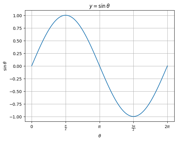
Saving figures as images
Matplotlib allows exporting figures as images or pdf.
x = np.linspace(0, 2, 100)

plt.plot(x, x, label="$y = x$")
plt.plot(x, np.sqrt(x), label=r"$y = \sqrt{x}$")
plt.plot(x, x*x, label="$y = x^2$")

plt.grid()
plt.legend()

# we can even give a title
plt.title("plot of $x$, $\sqrt{x}$ and $x^2$")

plt.savefig("plots.png")
plt.savefig("plots.svg")
plt.savefig("plots.pdf")
print("saved the figure as png, svg and pdf.")
saved the figure as png, svg and pdf.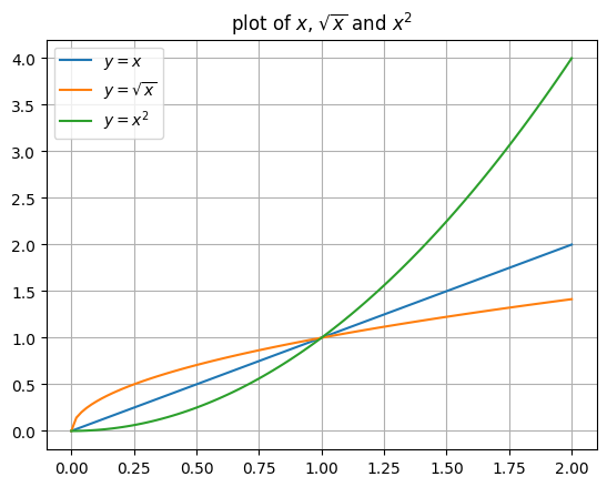
Problem: Plot \(\sin{\theta}\) and \(\cos{\theta}\)
Plot \(\sin{\theta}\) and \(\cos{\theta}\) in the same figure with \(\theta\) going from \(0\) to \(2\pi\).
Please use x ticks in increments of \(\frac{\pi}{2}\) and include legend.
Subplots
For complex visualizations, we need to display multiple sub plots and it is easy to do with matplotlib.
fig, (ax0, ax1) = plt.subplots(1, 2)

x = np.linspace(0, 2, 100)
ax0.plot(x, x)
ax0.set_title("$y = x$")
ax0.grid()

ax1.plot(x, np.sqrt(x))
ax1.set_title(label=r"$y = \sqrt{x}$")
ax1.grid()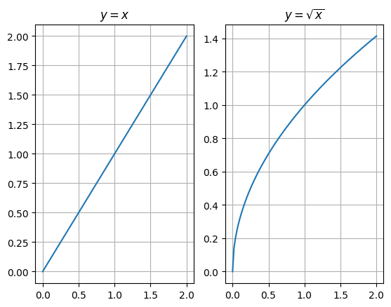
Please note that the y-axis scale is different for both the graphs. We can force the same scale using sharey=True when creating subplots.
fig, (ax0, ax1) = plt.subplots(1, 2, sharey=True)

x = np.linspace(0, 2, 100)
ax0.plot(x, x)
ax0.set_title("$y = x$")
ax0.grid()

ax1.plot(x, np.sqrt(x))
ax1.set_title(label=r"$y = \sqrt{x}$")
ax1.grid()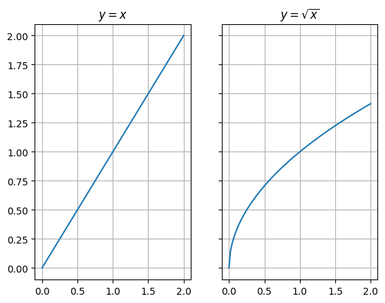
# specify custom fig size
fig, (ax0, ax1) = plt.subplots(1, 2, sharey=True, figsize=(8, 4))

x = np.linspace(0, 2, 100)
ax0.plot(x, x)
ax0.set_title("$y = x$")
ax0.grid()

ax1.plot(x, np.sqrt(x))
ax1.set_title(label=r"$y = \sqrt{x}$")
ax1.grid()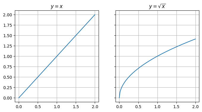
We can do the same with two rows and one column. In that case, we can sharex instead of y.
# specify custom fig size
fig, (ax0, ax1) = plt.subplots(2, 1, sharex=True, figsize=(4, 8))

x = np.linspace(0, 2, 100)
ax0.plot(x, x)
ax0.set_title("$y = x$")
ax0.grid()

ax1.plot(x, np.sqrt(x))
ax1.set_title(label=r"$y = \sqrt{x}$")
ax1.grid()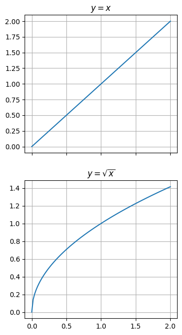
We can even do a grid.
# specify custom fig size
fig, axs = plt.subplots(2, 2, sharex=True, sharey=True, figsize=(8, 8))

def plot(ax, x, y, title):
    ax.plot(x, y)
    ax.set_title(title)
    ax.grid()

x = np.linspace(0, 2, 100)
plot(axs[0, 0], x, x, r"$y = x$")
plot(axs[0, 1], x, x*x, r"$y = x^2$")
plot(axs[1, 0], x, np.sqrt(x), r"$y = \sqrt{x}$")
plot(axs[1, 1], x, 2**x, r"$y = 2^x$")

# set super title
plt.suptitle("Exploring subplots");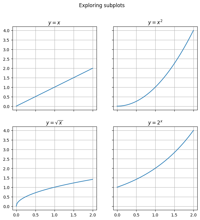
Problem: Plot \(\sin\) and \(\cos\) as subplots
Plot \(\sin{\theta}\) and \(\cos{\theta}\) as subplots with \(\theta\) going from \(0\) to \(2\pi\).
Please use x ticks in increments of \(\frac{\pi}{2}\) and include titles for the subplots.
Example: Lassajous Curves
Lassajous Curves are interesting mathematical curves that are generated using:
\(x = \sin{(at + \delta)}\)
\(y = \sin{(bt)}\)
def lassajous(a, b, delta):
    t = np.linspace(0, 2*np.pi, 1000)
    x = np.sin(a*t+delta)
    y = np.sin(b*t)

    plt.figure(figsize=(6, 6))
    plt.plot(x, y)
    plt.grid()

    # show delta as a fraction of pi
    delta_fraction = delta/np.pi
plt.title(rf"$\delta={delta_fraction}\pi, a={a}, b={b}$")lassajous(a=1, b=1, delta=0)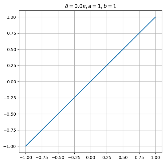
lassajous(a=1, b=1, delta=np.pi/2)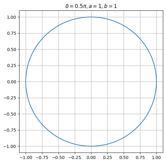
lassajous(a=1, b=1, delta=np.pi/4)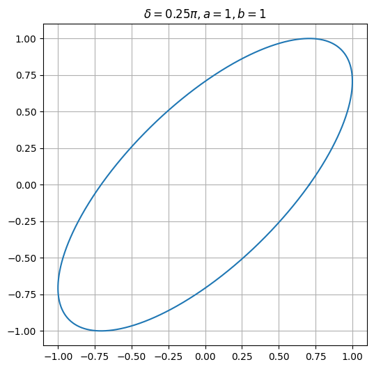
lassajous(a=1, b=2, delta=np.pi/2)
Problem: Table of Lassajous curves
Plot the following lassajous curves using subplots. The row labels in the picture shows the ratio \(a:b\) and the column label shows the value of \(\delta\).
It may be tricky to set the row and column labels as shown in the image. Specfify the value of \(\delta, a, b\) for each subplot.
