import pandas as pd
import matplotlib.pyplot as plt6 Making Pie Charts
Making Pie Charts is not as hard it seems. Matplotlib supports piecharts out of the box and Pandas provides a wrapper to plot one directly from a dataframe.
We’ll use the un-min dataset as example for plotting piechart.
df = pd.read_csv("../datasets/un-min.csv")df.head()| country | region | lifeMale | lifeFemale | infantMortality | GDPperCapita | |
|---|---|---|---|---|---|---|
| 0 | Afghanistan | Asia | 45.0 | 46.0 | 154 | 2848 |
| 1 | Albania | Europe | 68.0 | 74.0 | 32 | 863 |
| 2 | Algeria | Africa | 67.5 | 70.3 | 44 | 1531 |
| 3 | Angola | Africa | 44.9 | 48.1 | 124 | 355 |
| 4 | Argentina | America | 69.6 | 76.8 | 22 | 8055 |
6.1 Pie Chart with Pandas and Matplotlib
Let’s try to plot the number of countries in each region as a pie chart.
df.region.value_counts()Africa 53
Asia 46
Europe 40
America 35
Oceania 14
Name: region, dtype: int64counts = df.region.value_counts()countsAfrica 53
Asia 46
Europe 40
America 35
Oceania 14
Name: region, dtype: int64counts.plot.pie()<Axes: ylabel='region'>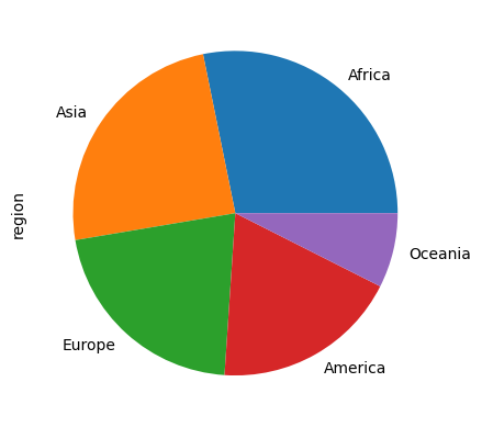
To show the percentage values in each slice:
counts.plot.pie(autopct="%1.1f%%")<Axes: ylabel='region'>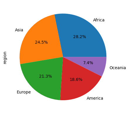
We can even highlight a slice. For example, the following snippet highlights the Asia.
countsAfrica 53
Asia 46
Europe 40
America 35
Oceania 14
Name: region, dtype: int64counts.plot.pie(autopct="%1.1f%%", explode=[0, 0.1, 0, 0, 0], shadow=True)<Axes: ylabel='region'>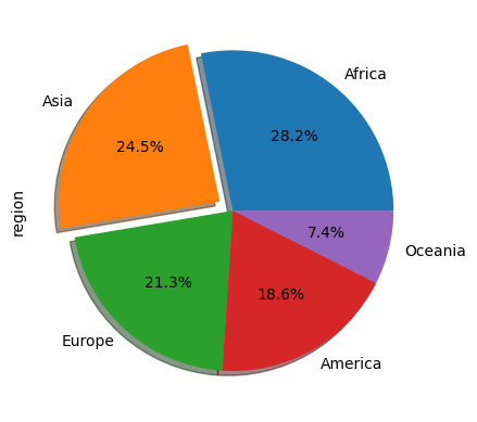
Asia was the second entry in the data. We’ve told to explode the second one by 0.1 while keeping everything else in the original place. The shadow=True adds a bit of 3-d effect.