import seaborn as sns3 Advaned Visualizations using Seaborn
While matplotlib provides simple visualiation charts that are easy to generate, the seaborn library provide more sophiticated charts often handly to present complex data from the bioinformatics.
3.1 Seaborn
Seaborn is a Python data visualization library based on matplotlib. It provides a high-level interface for drawing attractive and informative statistical graphics.
Seaborn has three categories of charts - relplot (relational), displot (distributions) and catplot (categories).
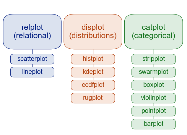
From Seaborn Tutorial.
3.1.1 Palmer Penguins

In this section, we’ll use Palmer Penguins dataset, which is comes packaged with seaborn.
The dataset includes measurements for penguin species, island in Palmer Archipelago, size (flipper length, body mass, bill dimensions), and sex.
df = sns.load_dataset("penguins")df.head()| species | island | bill_length_mm | bill_depth_mm | flipper_length_mm | body_mass_g | sex | |
|---|---|---|---|---|---|---|---|
| 0 | Adelie | Torgersen | 39.1 | 18.7 | 181.0 | 3750.0 | Male |
| 1 | Adelie | Torgersen | 39.5 | 17.4 | 186.0 | 3800.0 | Female |
| 2 | Adelie | Torgersen | 40.3 | 18.0 | 195.0 | 3250.0 | Female |
| 3 | Adelie | Torgersen | NaN | NaN | NaN | NaN | NaN |
| 4 | Adelie | Torgersen | 36.7 | 19.3 | 193.0 | 3450.0 | Female |
df.shape(344, 7)While seaborn can ignore missing values when plotting, it may be good idea in general to clean the data to remove missing values before starting any exploration.
# number of missing values in each column
df.isna().sum()
species 0
island 0
bill_length_mm 2
bill_depth_mm 2
flipper_length_mm 2
body_mass_g 2
sex 11
dtype: int64# drop the rows with missing value
df.dropna(inplace=True)# number of rows and columns in the data after dropping rows with missing values
df.shape(333, 7)3.1.2 Scatterplot
df.head()| species | island | bill_length_mm | bill_depth_mm | flipper_length_mm | body_mass_g | sex | |
|---|---|---|---|---|---|---|---|
| 0 | Adelie | Torgersen | 39.1 | 18.7 | 181.0 | 3750.0 | Male |
| 1 | Adelie | Torgersen | 39.5 | 17.4 | 186.0 | 3800.0 | Female |
| 2 | Adelie | Torgersen | 40.3 | 18.0 | 195.0 | 3250.0 | Female |
| 4 | Adelie | Torgersen | 36.7 | 19.3 | 193.0 | 3450.0 | Female |
| 5 | Adelie | Torgersen | 39.3 | 20.6 | 190.0 | 3650.0 | Male |
The scatter plot allows visualizing two dimentions. More dimentions can be added a scatter plot to control color, size and style.
# scatterplot of bill length vs bill depth
sns.scatterplot(df, x="bill_length_mm", y="bill_depth_mm")
<Axes: xlabel='bill_length_mm', ylabel='bill_depth_mm'>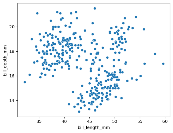
The scatterplot is a special kind of relplot. We can get the same output using the following ways as well.
When we specify both x and y arguments to
sns.relplot(df, x="bill_length_mm", y="bill_depth_mm")# scatterplot of bill length vs bill depth
# with color by the species
sns.scatterplot(df,
x="bill_length_mm",
y="bill_depth_mm",
hue="species")<Axes: xlabel='bill_length_mm', ylabel='bill_depth_mm'>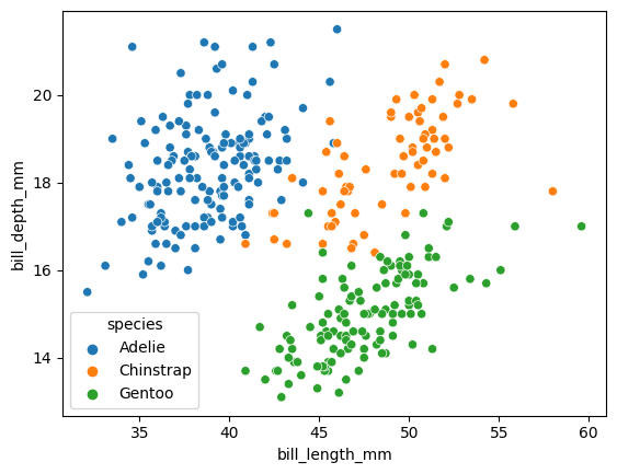
# scatterplot of bill length vs bill depth
# with color by the species and style by sex
sns.scatterplot(df,
                x="bill_length_mm",
                y="bill_depth_mm",
                hue="species",
                style="sex")
<Axes: xlabel='bill_length_mm', ylabel='bill_depth_mm'>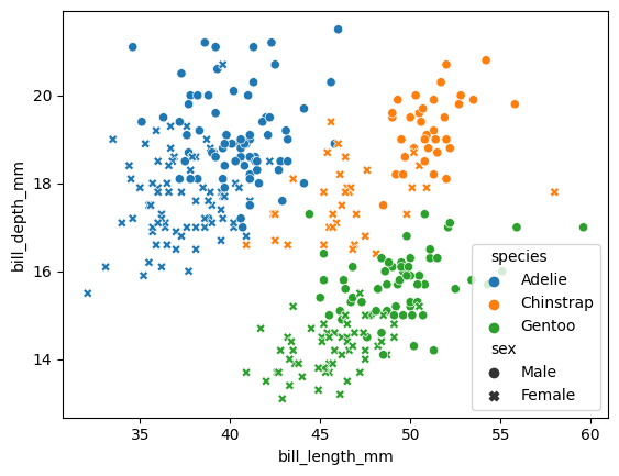
# scatterplot of bill length vs bill depth
# with color by the species, style by sex and size by body weight
sns.scatterplot(df, x="bill_length_mm", y="bill_depth_mm",
                hue="species", style="sex", size="body_mass_g")
<Axes: xlabel='bill_length_mm', ylabel='bill_depth_mm'>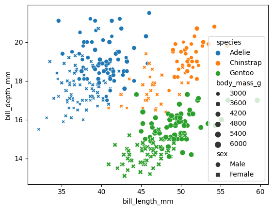
Seaborn allows drawing lines on the graphs using matplotlib primitives.
g = sns.relplot(data=df, x="bill_length_mm", y="bill_depth_mm", hue='species')

# draw a line using start and end points
g.ax.axline(xy1=(30, 13), xy2=(60, 19), color="g", dashes=(5, 2))

# draw a line using start point and slope
g.ax.axline(xy1=(35, 13), slope=.6, color="r", dashes=(5, 2))
<matplotlib.lines._AxLine at 0x7f6f9e001f30>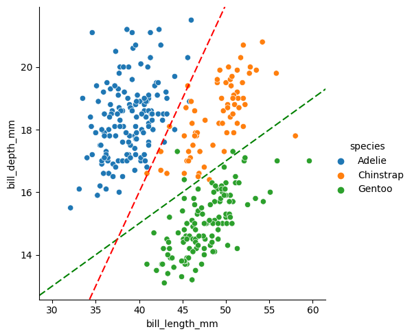
3.2 Distributions
sns.displot(df, x="flipper_length_mm", kind="hist")

# sns.histplot(df, x="flipper_length_mm")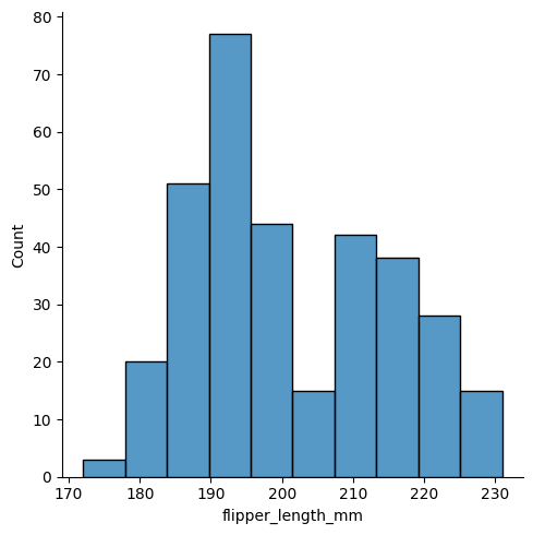
sns.displot(df, x="flipper_length_mm", kind="kde")

# sns.kdetplot(df, x="flipper_length_mm")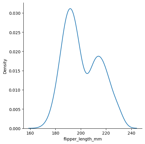
The distplots allow grouping by color.
sns.displot(df, x="flipper_length_mm", kind="kde", hue="species")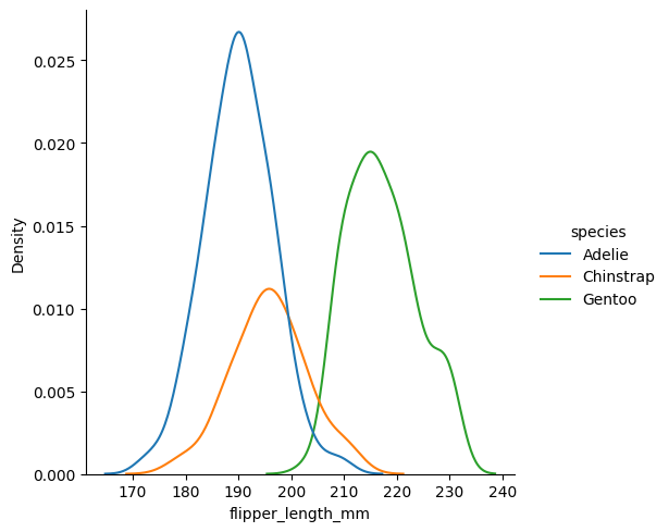
We can stack multiple distributions on top of each other.
sns.displot(df, x="flipper_length_mm", kind="kde",
            hue="species", multiple="stack")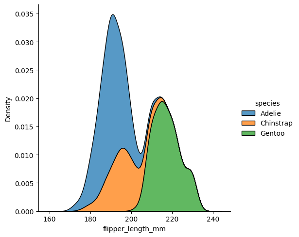
We could do the same with histograms.
sns.displot(df, x="flipper_length_mm", kind="hist",
            hue="species", multiple="stack")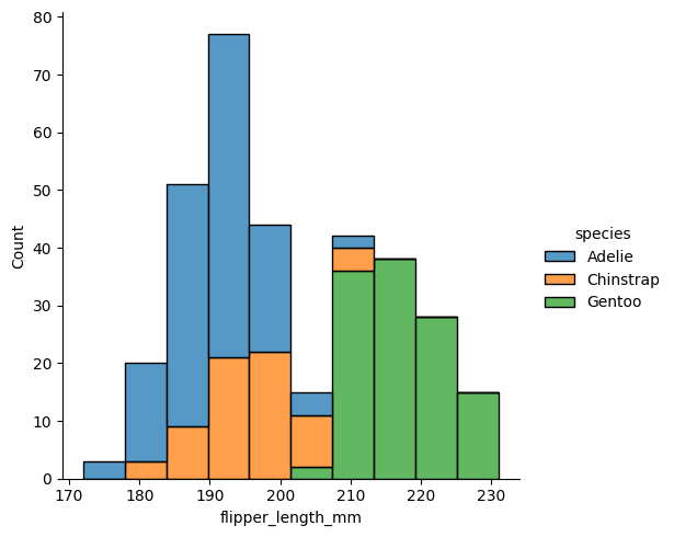
3.3 Categorical plots
Catplots allows visualizaing categorical data. The default view is a scatter plot with a small jitter added to make the points visible.
sns.catplot(df, x="species", y="bill_length_mm")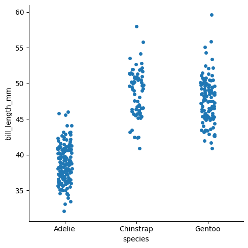
A slightly better looking version of that is a swarm plot.
sns.catplot(df, x="species", y="bill_length_mm", kind="swarm")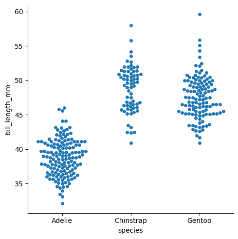
we can add another dimension usng hue.
sns.catplot(df, x="species", y="bill_length_mm", kind="swarm", hue="sex")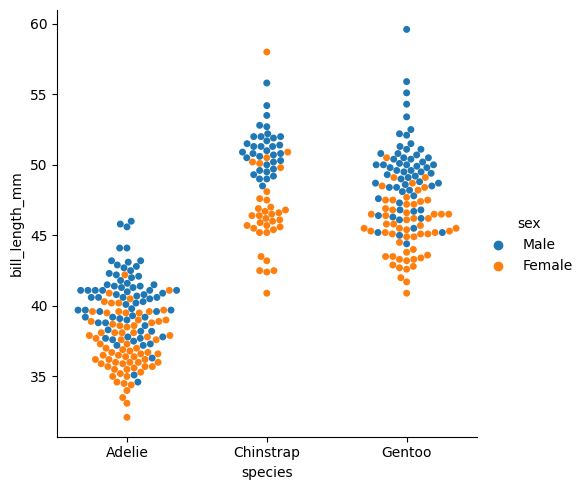
We could even flip the axes, if we want.
sns.catplot(df, x="bill_length_mm", y="species", kind="swarm", hue="sex")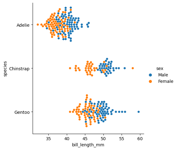
3.4 Comparing Distributions
The boxplot and voilinplot, kinds of catplots, allows comparing distributions.
sns.boxplot(df, y='bill_length_mm')<Axes: ylabel='bill_length_mm'>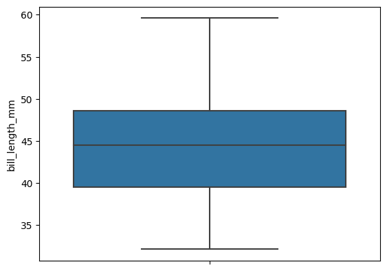
sns.violinplot(df, y='bill_length_mm')<Axes: ylabel='bill_length_mm'>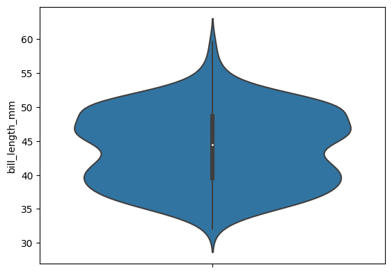
Both these plots allow splitting the distribution by a categorical column.
sns.violinplot(df, y='bill_length_mm', x="species")<Axes: xlabel='species', ylabel='bill_length_mm'>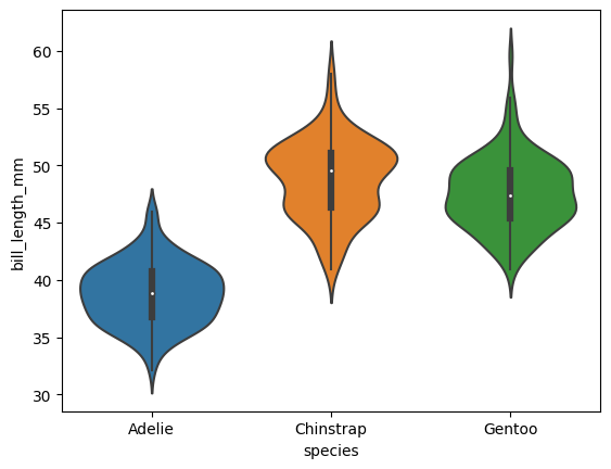
We could add another dimension using hue.
sns.violinplot(df, y='bill_length_mm', x="species", hue="sex")<Axes: xlabel='species', ylabel='bill_length_mm'>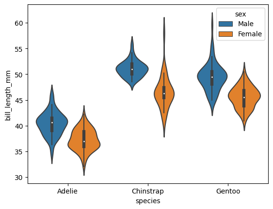
We could use the space better by splitting the violin when there are only two categories.
sns.violinplot(df, y='bill_length_mm', x="species", hue="sex", split=True)<Axes: xlabel='species', ylabel='bill_length_mm'>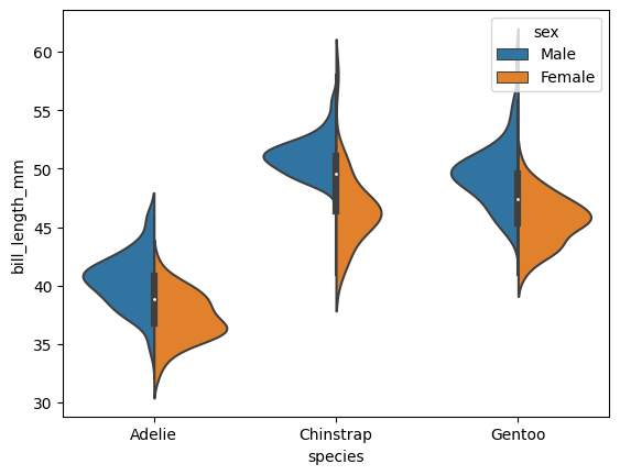
3.4.1 Combining multiple views on the data
The jointplot and pairplot plots both relationships and distubutions in a single graph.
sns.jointplot(df, x="bill_length_mm", y="bill_depth_mm", height=3)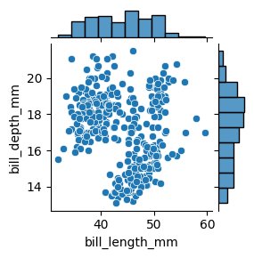
sns.jointplot(df, x="bill_length_mm", y="bill_depth_mm", hue="species", height=4)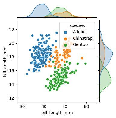
The pairplot show relations between all the numerical columns in a single grid.
sns.pairplot(data=df, hue="species")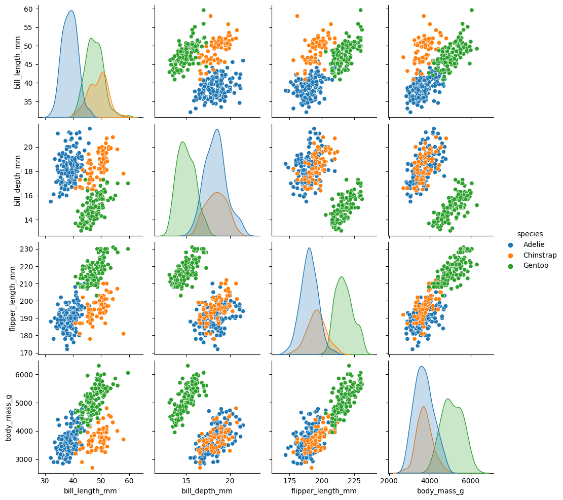
3.4.2 Showing multiple charts
Seaborn allows showing a grip of charts for displaying more information.
sns.relplot(df, x="bill_length_mm", y="bill_depth_mm", col="species", height=3)
sns.relplot(df, x="bill_length_mm", y="bill_depth_mm", hue="sex",
            col="species", height=3)
sns.relplot(df, x="bill_length_mm", y="bill_depth_mm",
            col="species", row="sex", height=3)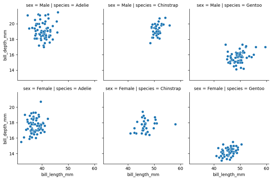
When there are too many categories, we can even specify col_wrap.
sns.relplot(df, x="bill_length_mm", y="bill_depth_mm", hue="sex",
            col="species", col_wrap=2, height=3)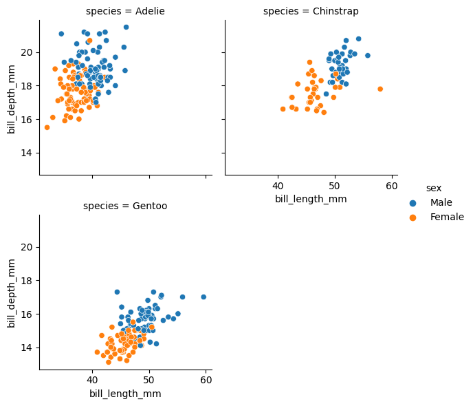
This functionality is similar to Facetwrap in R.
3.4.3 Multiple Charts in a grid
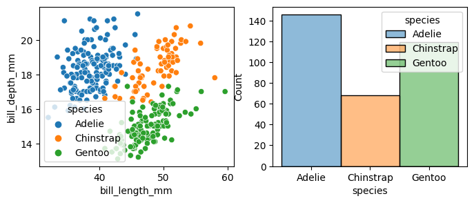
import matplotlib.pyplot as pltf, axs = plt.subplots(1, 2, figsize=(8, 3))
sns.scatterplot(df, x="bill_length_mm", y="bill_depth_mm", hue="species", ax=axs[0])
sns.histplot(df, x="species", hue="species", ax=axs[1])<Axes: xlabel='species', ylabel='Count'>